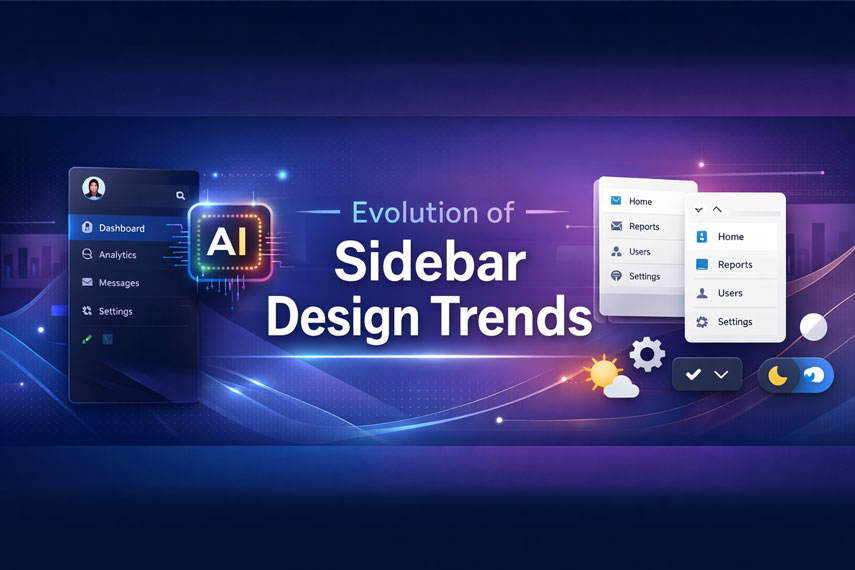
How to Design a Modern Figma Sidebar (2026 Guide) – Responsive Dashboard UI & Components
Sidebar components are essential in modern dashboard UI, admin panels, and SaaS web apps.
In 2026, Figma sidebar design focuses on responsiveness, accessibility, AI-assisted workflows,
and clean visual hierarchy. This guide walks you through trends, best practices, and
step-by-step techniques for building professional Figma sidebar components.
Core Features of a Modern Figma Sidebar
A professional sidebar balances usability with visual hierarchy. Recommended width ranges
from 240px–280px for expanded desktop layouts and 72px for compact mode.
- Icons: 16–24px scalable SVG (Lucide, Feather)
- Typography: 14px Inter or SF Pro
- Padding: 12–16px for accessibility
- Active state: subtle background (#3B82F6 at 20%)
- Dividers: 1px solid #E5E7EB
Sidebar Size Comparison Table
| Feature | Compact Sidebar | Expanded Sidebar | Use Case |
|---|---|---|---|
| Width | 72px | 256px | Mobile vs Desktop |
| Icon Size | 20px | 24px | Quick Navigation Scan |
| Hover Effect | Scale 1.05x + light background | Full label reveal | User Engagement |
| Divider Style | Dashed #D1D5DB | Solid #E5E7EB | Visual Hierarchy |
| Animation | 200ms ease-in | Micro-bounce expand | Delight & Feedback |
Premium Sidebar Figma Mockups (Editable & AI-Ready)
Explore ready-to-edit sidebar dashboard UI kits optimized for SaaS, admin panels,
and analytics apps.

Sidebar Dashboard Nav – Analytics UI Kit

Collapsible Admin Panel Sidebar
Accessibility & SEO Best Practices for Sidebar UI
- Maintain 4.5:1 color contrast ratio
- Ensure full keyboard navigation (Tab, Enter, Escape)
- Use ARIA labels for toggle buttons
- Use semantic landmarks (nav, aside, main)
- Support dark and light theme switching
Keyboard tip: Ensure focus states are clearly visible and collapse/expand
buttons are reachable without mouse interaction.
Advanced Sidebar Techniques (Variants & Interactivity)
Use Figma Dev Mode to export CSS variables such as:
--sidebar-bg: #F8FAFC;
Create overlay animations for mobile hamburger expansion.
Limit nested components to three levels for performance optimization.
Responsive & Future-Proof Sidebar Design
Modern dashboards require fluid sidebars. On mobile, collapse to an icon-only
hamburger navigation. On desktop, maintain fixed left positioning.
Future trends include AI-generated navigation flows, voice-enabled dashboards,
and 3D immersive UI components.